MapMaster 3 User Guide
Table of Contents
-
What is MapMaster 3?
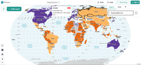
A GIS-inspired digital atlas: Layer thematic maps to analyze spatial patterns and data at regional and global scales.
Build 21st century data analysis skills with MapMaster 3! This interactive digital mapping tool helps students develop geographic literacy, spatial reasoning, and critical thinking skills by examining patterns and relationships across regional and global datasets. MapMaster 3 includes more than 500 cultural, economic, physical, and political datasets from authoritative sources such as the World Bank, United Nations (UN), NASA, NOAA, and the United States Geological Survey (USGS).
-
Getting Started
-
Building Maps
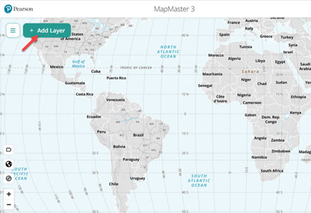
Creating a map in MapMaster is as simple as picking from our menu of more than 500 curated data layers. Use the Add Layer button to open the layer list and search, or browse, to find the layer you want. Use the Filter button to find map layers by theme, geography, or type.
Click on the layer name to see the layer details, including the source and map type, as well as a brief description of what it shows. Or simply use the Add button to add the layer to the map.
-
Reading Maps
Once a layer has been added to MapMaster, it becomes an interactive map that can be probed and analyzed to help understand details and patterns, and to find information about specific physical or political locations.
Maps can be zoomed and panned by mouse scroll pad as in Google or Apple Maps, by keyboard or screen reader, or by using navigation buttons or Zoom To options.
Data Probing: Use a mouse or scroll pad to hover over the map to see the precise data for a specific location or use a keyboard or screen reader to navigate to it. Probe countries in Latin America to see each one's guaranteed Maternity Leave, for example. Or probe the different temperature bands in the ocean to compare sea-surface temperatures at the equator to temperatures in the Arctic and Antarctica. Clicking a feature will keep its data probe pop-up on screen until it is closed with the X button, or the map is clicked elsewhere.
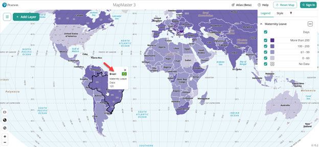
Use the interactive Map Legend to choose or find specific data on a map. Select or deselect categories in the legend to only display specific data categories or ranges. Filter an Urban Population map so that only the U.S. counties with the highest level of urbanization are showing. Click on the Deserts category in the legend of a Biomes map to highlight the locations of all the world's deserts.
Areas where there is no data in the data layer will be indicated by a lack of color and diagonal lines. These areas cannot be data probed. -
Setting up, Adjusting, and Styling Maps
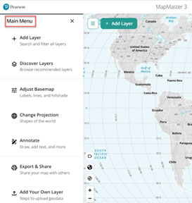
Easily customize your map by choosing a new map projection, picking map labels to be displayed, or choosing the map's color scheme. The Main Menu includes a Change Projection feature. Choose the right projection for your layer. La Niña is largely a Pacific Ocean phenomenon, so choose a Pacific-based projection for it. Using a U.S. or Canada map? Choose the Albers North America projection.
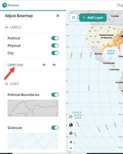
Use Adjust Basemap to choose which map labels (physical, political, cities) are displayed on the map. Label sizes can also be adjusted here, as well as options for showing the Graticule (lines of latitude and longitude) or Hillshade (light indications of elevation on land areas.)
The Main Menu also includes a Discover menu of map collections as well as its advanced features: Annotate the map with text, symbols, and shapes; Export & Share maps via URL or image download; Add Your Own Layer by uploading a formatted CSV file.
-
-
Using the Application
-
Navigating MapMaster
Upon launching MapMaster, start at the Main Menu, Add Layer button, or launch MapMaster Atlas mode.
The toolbar at the bottom left provides short cuts for adjusting and navigating the map.
- Use the Labels button to choose which map labels to display and adjust their size.
- The Zoom to region (globe) button provides a menu to zoom to specific regions.
- The Find my location button zooms to and indicates your approximate location. This may require enabling browser permissions.
- Use the Zoom buttons to zoom in (+) and out (-) of the map.
Interactive Legend
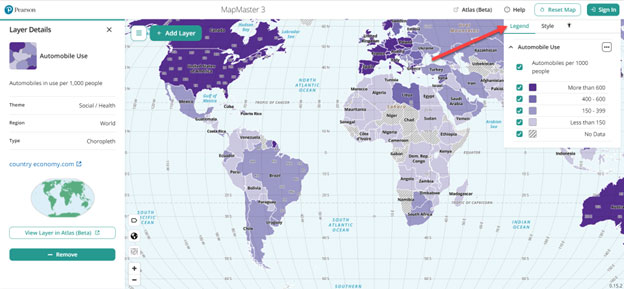
Use the Interactive Legend to highlight and filter the data on a map. The legend will appear when at least one data layer has been added to the map. Use the caret button next to the layer name to minimize or maximize the legend. The hamburger (3 dot) button can be used to see the layer details, such as source and map type, zoom to a layer's location, or remove the layer from the map.
Highlight specific data on the map by selecting the color swatch or symbol for a specific category or range. Each instance will be highlighted on the map.
Filter maps by selecting and deselecting the checkboxes for categories or ranges. Use the filter to eliminate countries or areas that fall outside a specific range. For example, to see only the most extreme effects of La Niña on sea surface temperature, deselect the middle ranges so only the highs and lows are displayed.
*Tip: Use the legend to quickly select and deselect or highlight a category or range several times to help locate or distinguish small and hard-to-find types of data on the map.
Style
Use the Style tab to change a layer's color(s) or adjust its opacity. Proportional symbols can be resized by adjusting the minimum and / or maximum size of the circles. -
Tools in the Main Menu
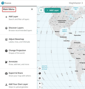
Discover Layers is a new way to find interesting or important layers. Curated collections of data layers based on themes, topics, or even specific countries can be found here. Recently accessed and popular layers are also highlighted in the Discover Layers menu.
Change Projection allows users to change the map projection used for their map. Because the globe cannot be displayed on a flat screen without distorting it in some way, map projections are used to preserve certain aspects of the globe like direction or area by choosing to distort other properties. The Mercator projection is used widely for web mapping as it maintains shape and direction along the lines of latitude and longitude, but area is increasingly distorted towards the polls. Thus, Greenland appears to be the same size as South America, when in reality it is closer in size to Argentina.
Mastering instructions will often indicate the best map for a given activity.
Annotate
The Annotate menu has tools for adding text, arrows, shapes, and symbols to a map. When using a Mercator projection, the Measure tool can be used to measure distances between points on the map in Kilometers. Once an annotation tool is active, it will remain active until it is clicked again in that Annotation menu, a different tool is selected, or the Annotation menu is closed.
Symbols are placed with a single click. Otherwise, all drawing is done by clicking once to create a starting point and clicking twice to finish drawing. Click once while drawing a line or shape to create another fixed point from which angles can be added.
When drawing a shape, the number of sides is determined by the number of clicks before double-clicking to finalize the shape. Double-clicking on the third point will create a triangle. Double-clicking the fourth point will create a square, rectangle, or other quadrilateral.
The color of a shape, drawing, or symbol can be picked in the Style section.
To edit or delete an annotation, use the Edit button. Then click on the annotation to be edited or deleted. Make any desired changes by dragging a point on a line or a symbol or use the Delete button to remove an annotation entirely. The Edit button will remain active until it is pressed again.
Changing map projections will remove any annotations on the map. Annotations cannot be shared via URL, but they will be included in an image export.
Export & Share
Once a map has been created and customized, it can be shared as a URL or exported as an image file.
Click the load button in the SHARE URL box to generate a URL. Shared URLs will save all the map options that have been selected when building the map including labels, projections, filters, and even the zoom and map location. Changing any of those elements on the map will reactivate the load button so a new URL can be generated.
These URLs can be shared with anybody, regardless of whether they are logged into MapMaster. Shared maps will always be interactive, but the Add Layer, Main Menu, and Atlas mode will only be available for registered users.
To download an image of a map, use EXPORT / PRINT IMAGE. Optional fields are available to add a Title and Subtitle which will appear as headers at the top of the map image, and an Author and Source for the map, which will appear as footers at the bottom of the map.
Use the Generate Image button to create a snapshot of the current view of the map, and then the Download Image button to save it. Saved images can be printed locally.
Add Your Own Layer
CSV files with political (country, state, county) or location (latitude and longitude) data can be uploaded to MapMaster from the Main Menu under Add Your Own Layer.
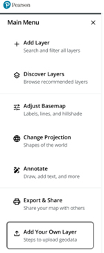
Watch a demo video of layer uploads.
Data Files
Political layers are uploaded using geocodes. Country layers use standardized ISO3 codes, such as USA for the United States or AFG for Afghanistan. States and provinces use FIPs codes, such as US01 for Alabama or CA01 for Alberta. County layers use five digit FIPs codes.
The Add Your Own Layer panel also includes downloadable templates with example political codes.
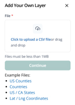
Political maps will add a color to any country, state, or county that is listed. CSVs that also include a value can be used to add numeric data to the map as a choropleth map.
Map layers that use physical locations can be uploaded using latitude and longitude coordinates as points. Layers that include values are symbolized as proportional symbols.
Steps to Add a Layer
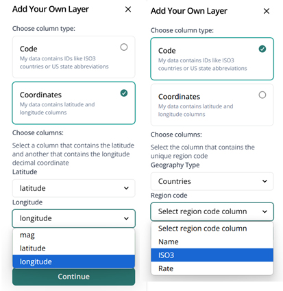
Use the Add Your Own Layer link in the main menu to upload a CSV file. Choose Code for political maps or Coordinates for physical location maps.
MapMaster will list the column headers in dropdown menus. Use the dropdown menus to select the required columns in the CSV file: Geography type and Region code for code maps or Latitude and Longitude for coordinate maps.
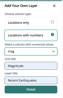
If the CSV includes numeric data to be symbolized, choose the Locations with numbers option, and then use the dropdown menu to select the column with the data.
If numeric data has been added, add a Unit title, such as Percent or Magnitude.
Add a Layer title to describe the map layer. This will be displayed in the Legend.
Once a layer has been uploaded, additional layers can be uploaded or added from the layer list.
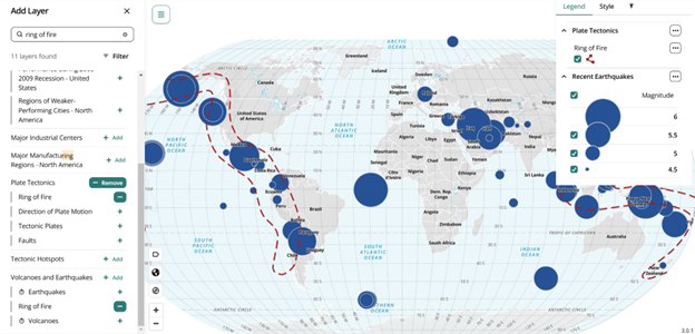
Maps with uploaded layers cannot be shared via URL. To download a copy, use Export / Print Image.
-
-
Creating Maps
-
Adding Map Layers
Use the Add Layer button on the left of the screen or in the Main Menu, Opening the Layer Menu displays all data layers in alphabetical order. Use Search to find a specific layer or topic.
Use Filter to refine search results or to narrow the full layer list. Layers can be filtered by theme, geography, or map type.
Adding Multiple Layers
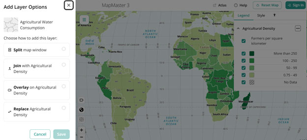
One of the most important features of MapMaster is the ability to compare or combine multiple data layers at once. Depending on the data layers being used, once a layer has been added, there are several ways to add additional layers. When you add a second layer, MapMaster will provide all possible choices for displaying the two maps together.
Compatible Layers
Some map types can always be added to a second layer. Points, like the location of military sites, can be added to any map, as they do not conflict with the underlying layer. The same is true of lines, which could include directional arrows or boundaries. These are typically reference maps. Proportional symbols can always be added to other maps for the same reason.
Layers that do not share a geography can also be added to the same map. A Sub-Saharan Africa data layer is compatible with a South Asia map, because their geographies do not overlap. Similarly, layers that have only land data can be added to layers that only have ocean data.
Splitting Maps
When two layers cannot or should not be displayed on the same map, a Split Map is the simplest solution. This displays one layer on the top half of the screen and a second layer on the bottom half. The maps are linked: panning and zooming on one map will pan and zoom the other. This can be unlinked using the chain icon button at the top of the lower map. Data probing a location in one map will highlight the same location on the other map, so the connections between the layers can be discovered. Highlighting a category or range in the legend of one map will show its locations in both maps.
Joining Maps
Layers that share a geography and type, such as Country Choropleth maps, can be joined together into a bivariate (two variable) map that displays both data layers in a colored grid. For a country map, this shows which countries are in the lowest level of both data layers, or in the highest, or any other combination within. This is a good map type to choose when the two data layers are related or correlated with each other. Income Per Capita and Years of Schooling might combine well into one bivariate grid, but Corn Production and Netflix Subscribers are not likely to make a meaningful bivariate.
Datasets often do not have data for every country or unit in the world. Areas with no data are always indicated by diagonal lines. When a bivariate map is drawn, one or both layers might be missing for an area. The first layer that is added will have diagonal lines that go left to right: /. Areas of no data for the second layer will go right to left: \. When there is no data in either layer, both diagonals will draw a pattern of Xs.
Data probing a bivariate map will show the specific data for both data layers.
Overlaying Maps
Overlaying is another way of adding choropleth maps to another data set by drawing proportional symbols on top of another layer. Proportional Symbols can be added to any type of map. Proportional symbols showing the rate of females with advanced degrees could be overlaid onto a reference map showing former Soviet states to examine how they compare to the rest of Europe. This is also a good map type to use when many countries in one data layer have no data, as the symbols will only be drawn where there is data, reducing visual clutter.
Themes describe the main topic of a layer, such as Economic, Population, or Physical Environment. While themes can overlap, each data layer is assigned to one theme only.
Geographies describe where on the map the data applies. Most maps are considered World maps, but others are specific to a region, like Europe or South Asia, or to a country like the United States. Oceans is a unique geography as well. -
Map Types
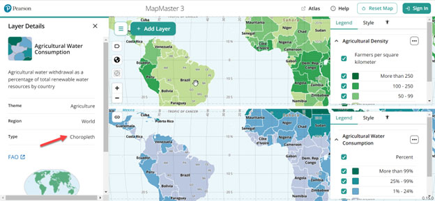
- Categorical – Maps where different data categories are depicted on the map using different colors. This can include polygons (or shapes showing physical dimensions) or political units like countries.
- Choropleth – Maps where numeric data ranges like percents, numbers of people, or inches of precipitation are displayed as color gradients.
- Proportional Symbol – Maps that use circles or other shapes sized proportionally to the value they represent. Larger circles indicate higher numbers or rates.
- Reference – Maps that indicate the presence of one category of data. Examples include countries that use Arabic as an official language. It can also include point layers that indicate locations or incidents, such as uranium mines or terrorist attacks.
- Layer Groups – Groups of related layers that can be added to the map together. One example, an idealized weather map, includes air pressure, temperature, and hurricane location layers. The child layers of the parent group can be added or removed independently.
- Raster – Maps that are created using imagery rather than data, like the Blue Marble Satellite View of Earth. These layers cannot be probed for additional information.
- Animated – Maps that display data over a range of time. Animated, or temporal, maps are indicated by a time icon in the Add Layer list.
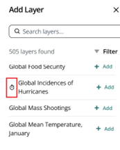
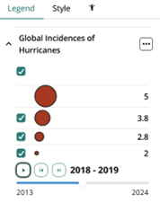
Animated maps include a time range and an interactive timeline scrubber in the legend. The play button will display each increment of years in roughly two-second intervals. Use the Next Year and Previous Year buttons to navigate to specific dates manually.
-
-
Accessibility
-
Accessible Tools
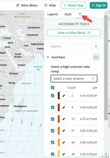
Additional features to help users who have difficulty reading visually complex or colored maps are available in the Accessible Tools tab. The View in Atlas mode button opens the current map in MapMaster Atlas mode where the data layer is provided as tabular data. Some layers also include a long description for additional context.
Use Search to find and highlight specific countries or other political units, or to highlight the areas that fall into a specific category.
Users with difficulty interpreting the default gradient colors on a map can choose to change the map to a high-contrast color scheme.
Maps based on political units like countries will also show a count that indicates how many countries fall into each category or range. This can help reinforce patterns in the data depicted visually on the map.
-
Atlas Mode Beta
MapMaster Atlas mode is a new accessible application that presents the same data layers in MapMaster as text and tabular data. It is optimized for screen readers but is a useful tool for all users.
A link to the Atlas mode homepage is found on the top right of MapMaster. To access a layer that has already been loaded in MapMaster in Atlas mode, there is a View in Atlas mode button on the Accessible Tools tab of the interactive legend.
On the Atlas mode home page, find a layer by browsing by theme or geography, or choose All Layers to access the complete list, which includes a search box.
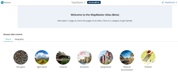
A layer loaded in Atlas mode includes a description, alt-text, a window with the interactive map, and a table with the data used in the map. Complex layers or ones that do not translate well to the tabular format include a long description with additional relevant information.
The data table is sortable and can be filtered by category or rank.
Once a table has been loaded, another layer can be added by using the add columns button.
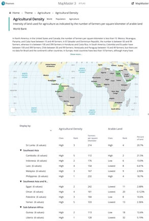
The table is displayed by country by default. Use the Display by: dropdown menu to choose a data layer to display the data. For example, a biomes map can be displayed by agricultural regions to see how those physical features interact.
MapMaster Atlas mode is a brand-new tool for accessible mapping and will be fine-tuned and iterated on throughout the year while it is in Beta release. We are very interested in any feedback or suggestions. Please email mapmaster@pearson.com.
-